Within a month of joining The Co-operative Bank, I was involved with the redesign of the public website. In particular, I led the UX for the credit card product & service pages, along with a range of help and support pages and campaigns.
We used various patterns to construct clear hierarchy of information for each product to make sure customers understood if the product was right for them.
Discovery
After numerous interviews with a range of customers and stakeholders, it became clear our customers wanted transparency, functionality, reassurance and clarity of information when choosing which banking products to apply for.
Defining the problem
The aim of the redesign was to create a website which was easy to navigate, provide simple, straightforward copy and clearly call out key information to help support everyday and vulnerable customers.
Design
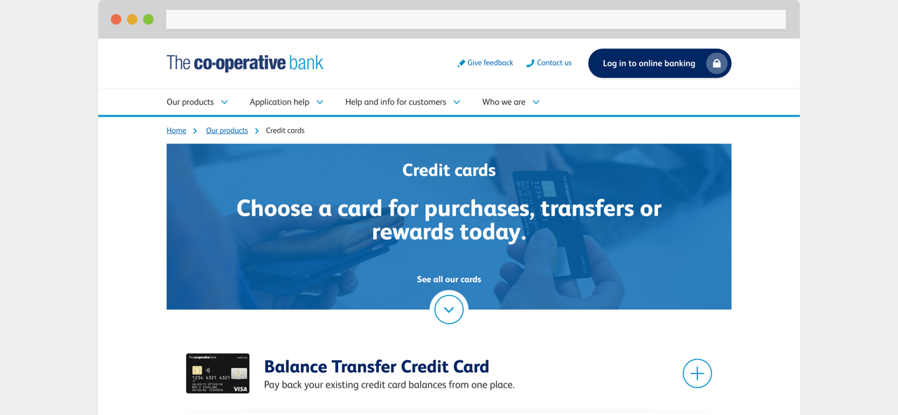
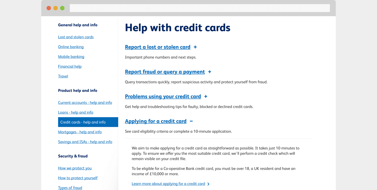
Through understanding both customer and business needs we began to continually prototype ideas and test with users. We started to try breaking down content into small, manageable sections so customers were not overwhelmed with information all at once. For example, all credit cards were listed in an accordion with key information about what the card was for. If a customer wished to find out more, they could simply click on the accordion to expand. This tested well as customers were able to make a clear decision on which card would be more suited to their needs.
We built out our prototypes in Axure (from low fidelity to high)
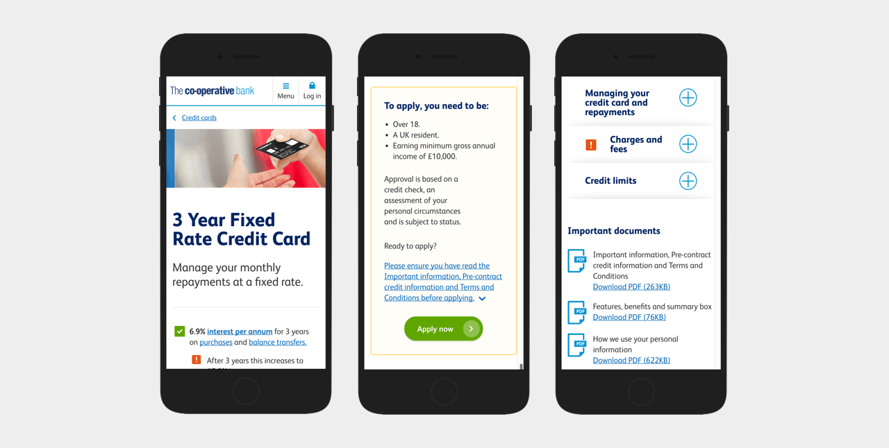
We redesigned the website mobile first to ensure experiences were optimised across all platforms.
Co-designing with sales, legal and compliance teams
Working very closely with UX writers, we tried experimenting with notorious jargon that filled banking pages. Due to compliance and legal requirements, we needed to keep the jargon however, we created popups for each one which gave a clear description of what it meant. This way we were helping customers understand content, whilst also meeting regulations.
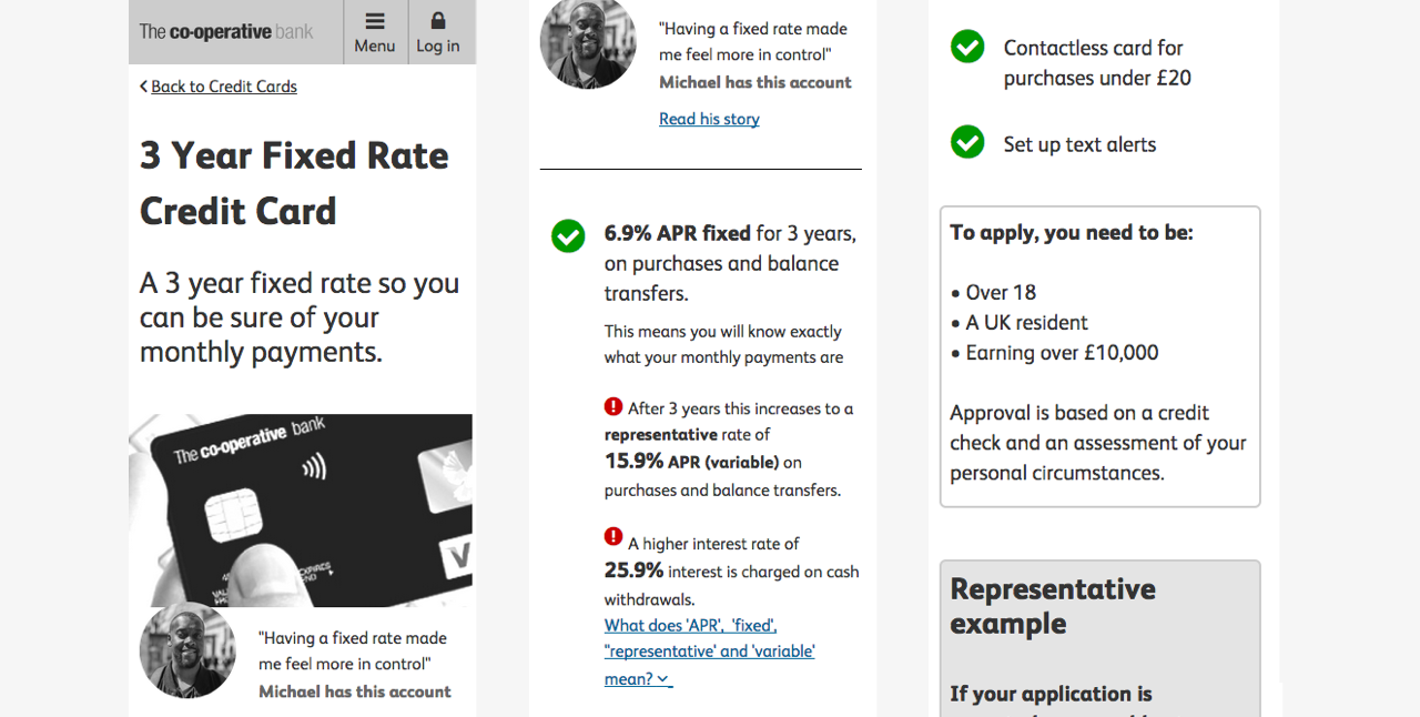
A key objective for the website was to call out key information a customer should know before applying for the product, essentially we wanted to bring out the terms and conditions which would normally be in small print or hidden. We did this by using green ticks for product features and red exclamation marks to highlight important details. At first our sales teams were very reluctant to sign this off as they feared red alerts across the pages would put customers off. I helped reassure stakeholders that during user testing customers found this incredibly useful and this gave them more confidence in the banks ability to advise them on the right product.
Another heavily regulated piece of content was the representative examples. Many customers found these confusing and full of jargon & numbers that didn’t make sense. A er working very closely with our compliance team, I began to understand the content more and as a team we experimented with designing a conversational style rep example. This tested really well with users, but our compliance teams were concerned we were straying away from being regulatory. With a lot of sessions and reviews, we came up with a compromise which still met both customer and business needs.
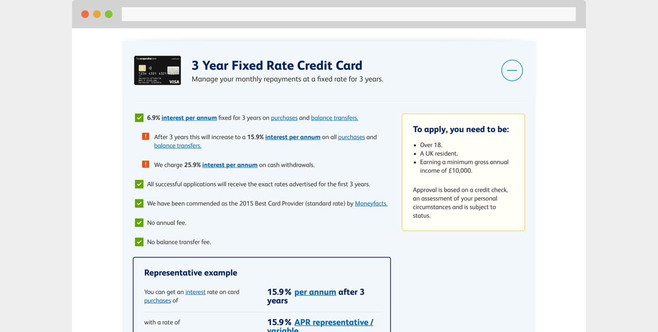
We used icons and colour to highlight key information to customers, for example about rate changes and admin charges.
Designing user centric help content
As well as focusing on sales aspect of the credit card journey, I also worked on the help content. This involved doing a number of card sorting and tree testing sessions to understand where customers would go to find help about their credit card.
Testing revealed that customers were split, some would go straight to the help and support area of the website, whilst others would go to the product page itself. This led me to make sure I designed contextual help into the product pages and also provided substantial content in the help and support area too.
When doing tree testing we discovered that half of customers would find help in the help section of the website and the other half would go to the specific product page.
Without testing this first, we may have just put the content into help and support and assumed customers would go there. This highlighted the importance of always involving our customers throughout the design process.
Delivery
During the project I was heavily involved in engaging with stakeholders, holding workshops, getting content and designs signed off from both compliance and legal and delivering the page designs successfully to the development team.
Handing over a prototype of the whole site
The delivery of designs to the development team involved spending a lot of time creating design specifications for patterns and pages. The whole website redesign was designed in an Axure prototype, which meant demonstrating functionality was easier, however keeping once source of truth over hundreds of pages became tricky. This then required myself to pair up with developers to check for correct padding, spacing, typography and even sometimes copy.
Getting builds signed off by stakeholders
Once the website was built and in preview mode, all the pages then required another final sign off from all stakeholders. This involved holding stakeholder preview meetings, which would often include myself and developer to make changes as we went through each page. This required quick decision making and sometimes pushing back on stakeholders when a decision could potentially cause issues to our customers and we would need to do further testing.
Results
For the business
90% increase in credit card applications
3x more current account applications
Won ‘Loving your customer’ award at the UK Financial Experience Awards.
Created a design system with guiding principles for all content going forwards.
For customers
Customers said they were more likely to apply for products with us as they knew all the key information up front and therefore trusted us as a bank:
“I like it because it’s not just a bank, it’s supporting people.”
Met accessibility standards which hadn’t previously been considered.
NPS increased by +5.9 (21 points above expectation).