Whilst at TalkTalk, I was tasked with helping customers digest complex broadband bills
Since joining TalkTalk, my aim was to understand customer pain points across the full end-to-end journey and work with the business to come up with solutions to solve the issues. One of the key customer pain points, and the main driver of calls to TalkTalk's call centre, was confusion around the bill.

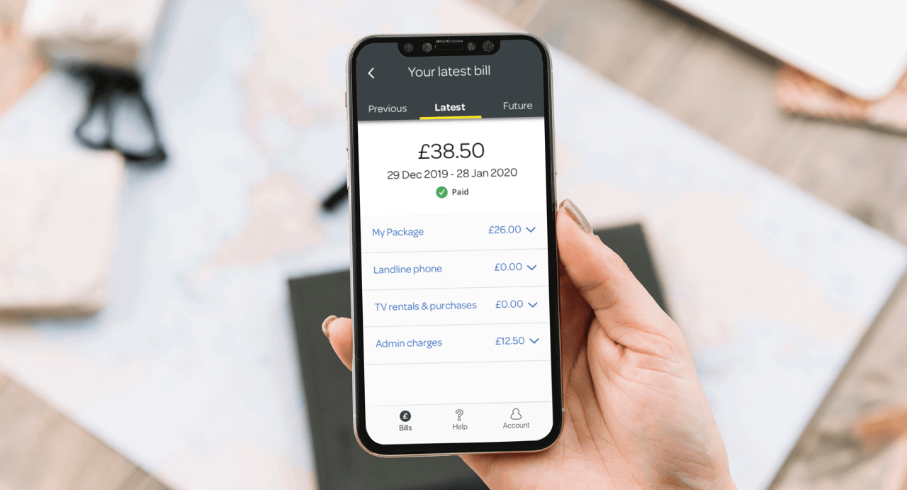
Old bill design on app
Discovery
Business needs
As bill confusion was the main driver of calls to the call centre, the business was keen to address this issue and look for ways it can better serve customers digitally to help save money and time spent fixing, explaining and refunding customers.
User needs
Working as the sole designer on the TalkTalk app, which contained the bill, I wanted to discover how customers pay for their bills, what their expectations are and how they find the billing experience currently on the app. To help me answer these questions, I engaged one of the researchers and we started to work together on our strategy.
We decided to get some insights right away, and with limited budget to do lab interviews, we went out to do guerrilla research at Media City in Salford. Armed with our discussion guide, app prototype and some Costa gift card vouchers (as incentives) we headed out to get some insights from the general public. Unfortunately, Media City was empty and we struggled to speak to as many people as we had hoped. We did manage to speak with a couple of people and gained some valuable insights, but this wasn’t enough.
We then looked at what tools we did have and decided to set up a test on remote testing platform, UserTesting.com. Using our iOS prototype we put our questions and tasks to 10 participants of equal split (5 males and 5 females) aged between 26 – 55. Within hours we were getting insights and began to compile our results.
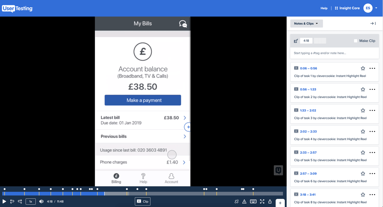
Testing the current bill on UserTesting.com
Defining the problem
The results showed that nearly all participants struggled with the terminology and structure of the bill. It became clear that customers simply wanted to know how much they were being charged, and what for. Instead, they were presented with complex terminology, hidden items and content in multiple places, which made it difficult to make sense of the bill as a whole.
We turned the issues we had observed into a problem statements to take into ideation, the first being: How might we make billing language more understandable for customers?
Design & iteration
Our first recommendation was to change the bill terminology, so it became more understandable. Our other recommendations included improving the structure and navigation of the bill. To help validate our recommendations, we initially looked at improving the main issue - the terminology. We also knew that this change would require minimal development and so would could impact the current experience on the live app quickly.
Having a few questions ourselves about the terminology, we reached out to the billing team, and clarified those questions. We then wrote a few drafts, with multiple options and challenged them by launching a survey. We shared the survey with various teams to help us provide a new clearer, more customer focused vocabulary that we could test with users.
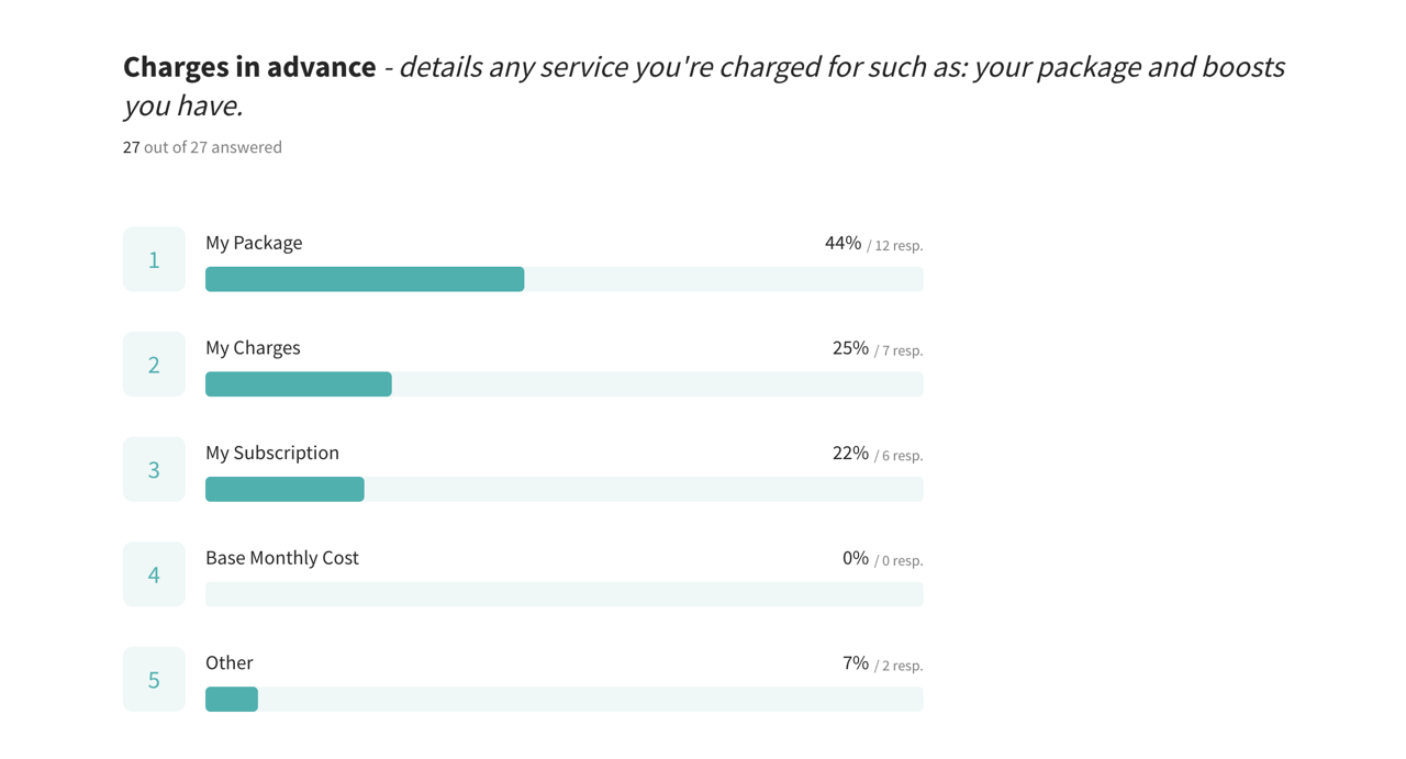
Bill terminology survey to improve customers understanding
I quickly made the changes to the terminology in the prototype and we put the same test live to see if this had improved customers understanding of the bill. This round of testing was very successful, giving us an indication that by simplifying the complex terminology, it helped customers have a greater understanding of their bills. There was a NPS increase of 60 points from -20 in the first round to 40 in the second round of testing.
However, as we only changed copy we still observed issues with structure, location and navigation of information within the bill. With work still to be done here, we came up with a problem statement to solve these issues: How might we design a bill that is clear to view, understand and navigate?
Sharing our insights with stakeholders
With some great discoveries we started to share our insights with the customer experience team, billing team and the development squads. We shared stats, clips of participants and analysis of both rounds of research, comparing the results and impact on users.
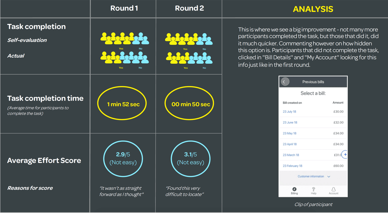
User testing analysis report we shared with various stakeholders and teams
Iterating on the outstanding pain points
To solve the outstanding problems we had uncovered, we then ran an ideation and co design session to come up with ideas that solved the problems around navigation and structure of the bill. This involved getting a multi disciplined team to do bill mapping, competitor analysis, ideation and build a paper prototype, all in a day. After we created range of prototypes, we voted on the idea(s) that solved the problem most effectively and built this design into the existing prototype.
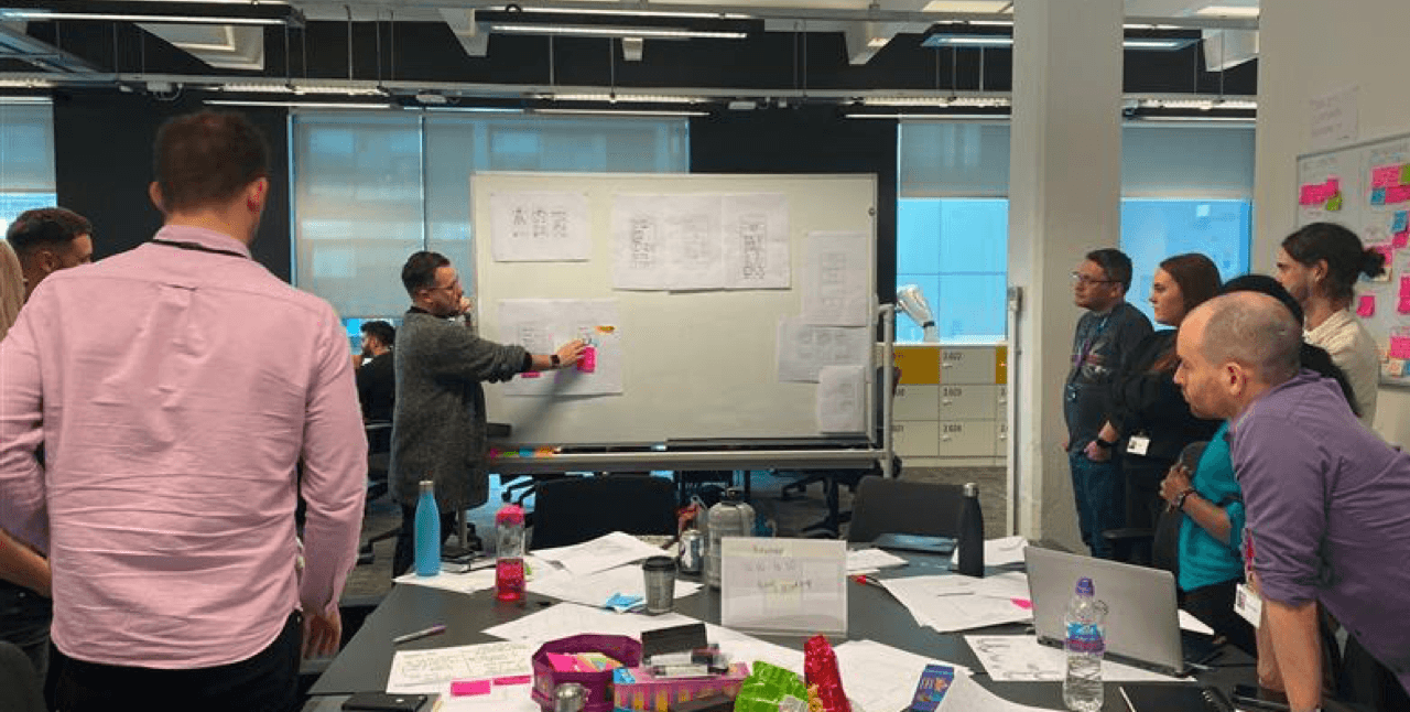
Bill ideation workshop with the billing team, product team and UX team
After the design session, we put the same test live with the new prototype. The results came back even better than the second round of testing with an increase in NPS of 10 points and when asked if participants would make any improvements, they said: “I wouldn’t, it’s better than the bills I get.”
Delivery
Throughout the whole process, we were able to deliver many solutions to help customers billing experience. One of the first quick wins was changing the terminology, which has already had huge impact to customers with minimal development work required. For the other validated solutions, we have broken them down into user stories and started to add them into the delivery backlog to be implemented when ready.
New bill design, now being delivered to across various platforms
Results
In only a couple of weeks and with limited resource, we had discovered key customer pain points, designed and iterated on solutions and already started to improve the billing experience for our customers.
For the business
Changes to terminology have already reduced calls and live chats regarding bill understanding, which has reduced costs for these services.
Highlighting the impact of a user centred approach is now being rolled out to other product teams so the customer experience can be improved across the full end to end journey.
More stakeholders are now coming to the UX team to help them solve problems effectively, with customer research and collaborative design.
For customers
Customers are now able to understand the billing terminology and are able to digest their bills easily so they don't need to call for clarification and can be confident that they are paying the correct amounts for their service.
The bill changes are being rolled out across all billing touch points, so customers using various platforms will benefit from the improvements.