As part of The Co-operative Bank redesign, we took our research and findings and applied this knowledge to the Smile website redesign with a twist.
Discovery
When Smile Bank launched in 1999, it was the UK’s first internet-only bank. It continued to be innovative with its campaigns, its ethical interests and its value of customer input therefore leading to an abundance of existing customers. However, it was struggling to attract new customers with its lack of a great digital proposition.
Defining the problem
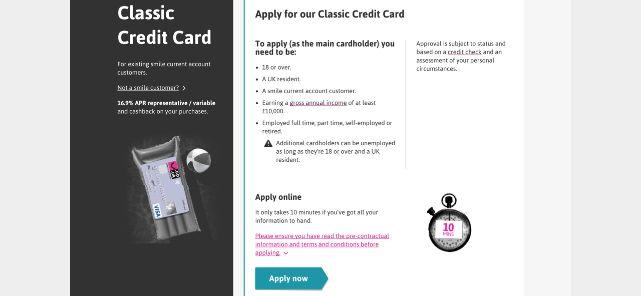
The aim of the redesign was to create a website which not only usable, mobile friendly with clear information and customer journeys, but to bring the brand of smile alive again. To maintain great service to existing customers, but to also attract new customers through a smart, different, cool digital proposition.
Design
Through lots of user research with both existing and future customers, we learnt what was great about the bank and also what new customers would be looking for to join. One of the main insights we heard was there was something interesting about Smile, it had character and wasn’t your typical bank. Therefore, we started to design around this unique feature and surface more personality into the website.
Firstly, we looked at the words. Similar to the work produced for The Co-operative Bank redesign, we understood how important it was to give customers clear, conversational style copy that they could understand. With Smile we wanted to take this further by adding the humour and personality into copy. At first this tested well, but some users thought if it was too jokey they didn’t know if they could trust the bank to look after their money. Our new tone of voice also struggled to meet the needs of our legal and compliance teams. Through iteration we were able to create a tone of voice across the website that was friendly, humorous but also guiding and informative.
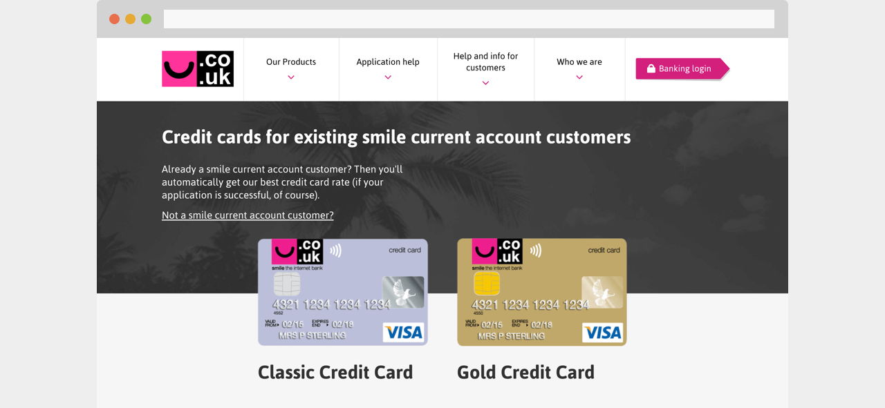
As we discovered Smile's personality needed to be more stripped back with regards to wording, we thought we could surface this more through iconography and imagery. The aim of the imagery was to be gregarious, informal, cool, not your average bank.
The style was inspired by vibrant pop culture and its raw cut and paste nature created interesting compositions to highlight the brands personality steering away from your typical stock imagery found on banking websites. This tested really well with users who wanted to engage with the content more, but also be part of a bank which had attitude and wasn’t the same as the rest.
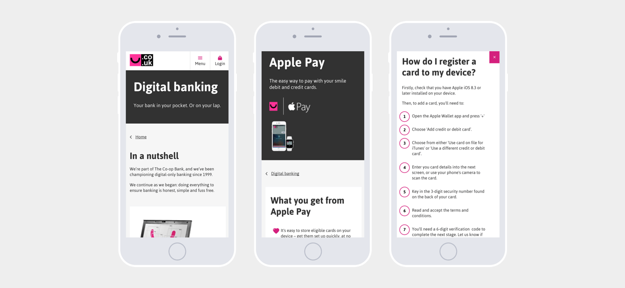
Being the UK’s first internet-only bank, designing mobile first was key especially as the old site was not responsive.
Results
The result is a new digital experience that’s simple, down to earth and much more user-friendly. Using existing brand guidelines, we have created a new layout that’s easier to use and more intuitive - helping to support vulnerable customers across each journey. We tested all our digital content to make sure it meets accessibility guidelines and turned the whole site into a mobile responsive website.