Working with digital branding and design agency, MERó, the aim was to create compelling branding to package our game. As lead UX designer, I worked with our brand team to help make sure the branding was right for our audiences.
User needs
To meet the needs of our target audience, we needed to create a brand that was distinctive, cool, tied into the game and captured their imaginations.
Design
The logo for the game initial started as blurred letters reminiscent of dreams and through iteration developed to include bold, blocky, geometric elements from the game. When tested alongside other designs, this one was always the favourite and also noted to be most like a game logo when asked by our audience.
Lettering that formed the logo had a geometric aspect which perfectly matched the game world aesthetic
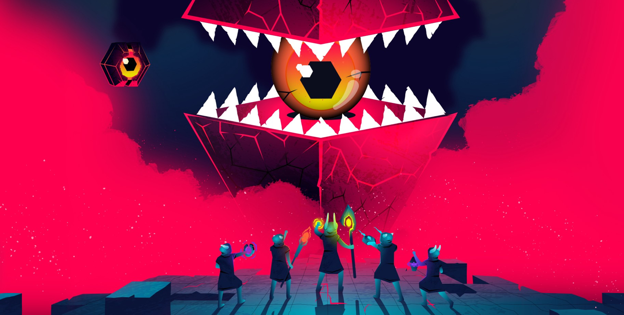
For the icon, we first tested a simple N from the logo, but this looked a little too similar to other apps including Newsround and Netflix. Some kids also thought it was a messaging app or even a dating app. We also wanted to stand out against the others. As an experiment, the eye from the game enemies was tested. This instantly grabbed the attention of our audience as it was playful, intriguing and communicated the essence of the game story: Nightmares always ready, waiting to be defeated.
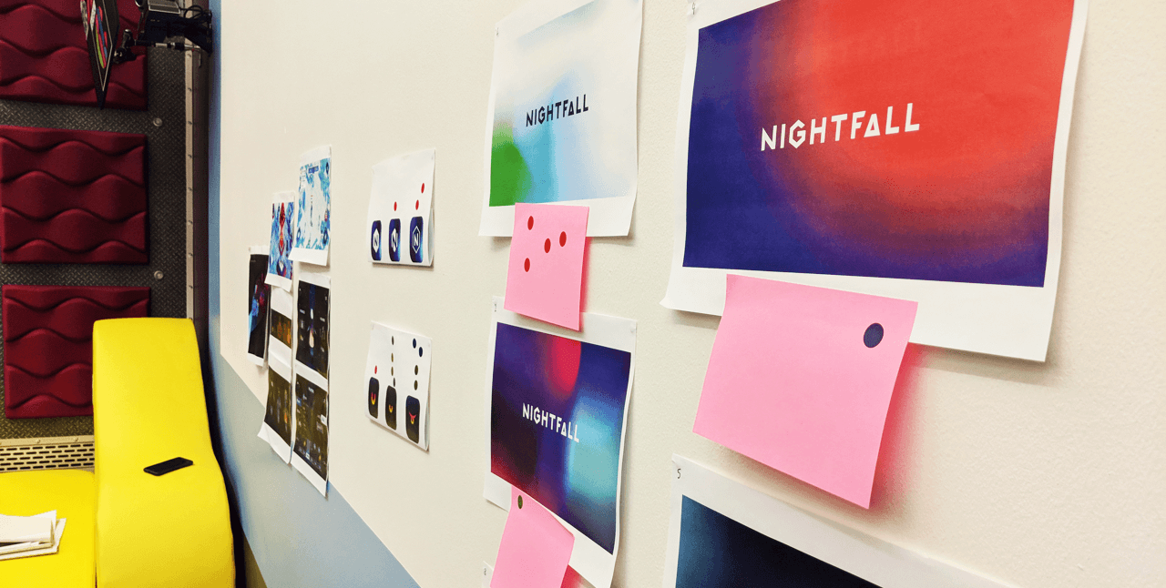
We would put content on the wall and run silent critique sessions through dot voting with children before asking them to give reasons for their votes.
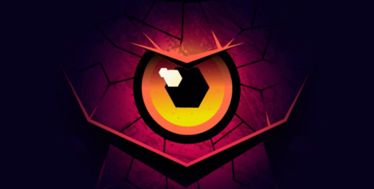
As the eye is a feature in all of the baddie characters it became the most recognised element that children would comment on, hence why using this as the icon.
Throughout the project, we introduced a lot of brand testing when conducting our game usability testing. This allowed us to try different methods for gaining useful insights to steer the direction of the branding work. It also ensured our audience was always at the heart of design decisions.
User feedback
“This looks so cool”
“The eyes are always watching you, reporting back to the boss"
“This is scary but cool.”
Branding applied to the game
After the branding guidelines had been defined, I began to work on how the brand would be implemented across all the game screens.
Design challenges
Although the brand guidelines had been completed, the UI in the game was still to be updated with the new colours, styles and fonts. With no plans in the roadmap to work on this, I took it upon myself to start designing up the screens following the brand guidelines and started to create a design system for the game.
At first both the product team and game development agency were reluctant to prioritise design changes over game functionality. However, I felt strongly that the brand needed to be applied to the game, not only for consistency reasons, but also due to the original game containing accessibility and usability issues due to ill-defined buttons, eligible text and overlaying of elements. The brand was clean, bold and vibrant and contained a strong call to action colour which gave clear hierarchy to interactive elements.
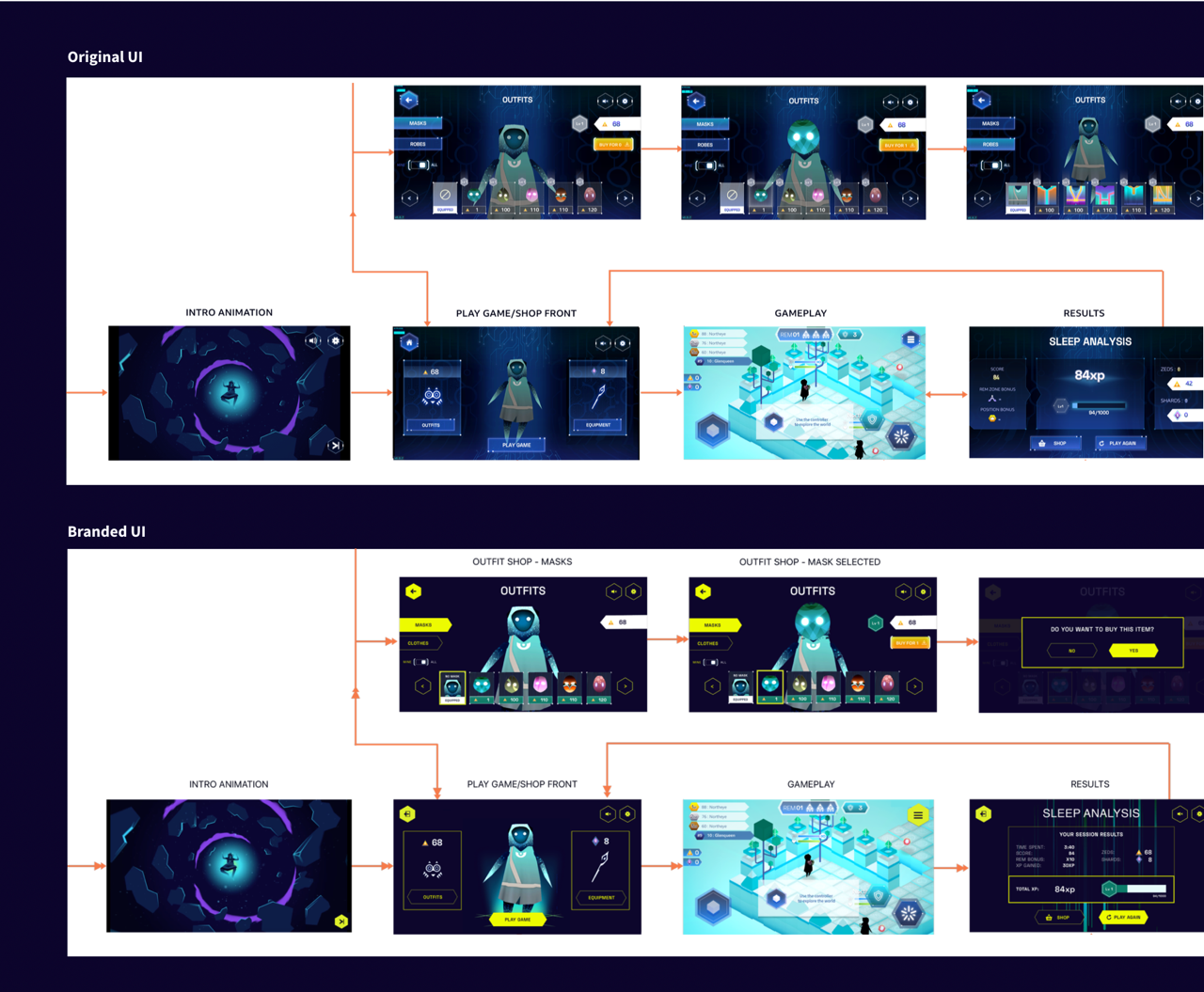
Comparing the original UI to the new UI based on the Nightfall branding
In order to push the need for changes to be applied, I tested the branded UI against the original UI to gather user insights into which performed better. The new designs I had mocked up were more usable, accessible and more engaging for our audience. Once I started to share these insights the product team started to prioritise design changes into the build.
Results
All work going forward for Nightfall was designed using the design system I created. In addition, the product team always considered the design changes as of equal importance as game functionality.