After redesigning the personal banking site, there was a need to redesign the business banking site and its forms to meet the often forgotten needs of those customers.
With all the team had learnt from the personal banking redesign, we took the same approach but applied it to a completely different user type. The first part of the website we tackled was the current account application form, due to customer needs but also business and regulatory needs.

Discovery
User needs
Business owners are busy, have lots of paperwork to deal with, so many things on their mind and need to get a current account set up as soon as possible. They need something that is simple, reliable and they can complete as quickly and efficiently as possible.
Business needs
Less mistakes made by customers filling in by hand and then having staff having to retype the information into our systems leading to more mistakes, less time spent correcting mistakes or blanks in forms by having to ring customers to get more information.
Regulatory needs
All banks were required to have an online application form for business banking customers by a certain date.
Defining the problem to solve
Through analysing both user and business needs (and tight demands from our regulators), it was decided we would use a lean approach to identify customer needs, build a high quality prototype to test and iterate with users and work with all staff involved in the current process to create an online application form that met the needs of everyone.
This was an online application form, that was easy for customers to use but also easy for staff to process and get the information they need to decide who is successful.
Design
Reviewing current application form with the business banking app form team to determine what questions were needed and what could be removed.
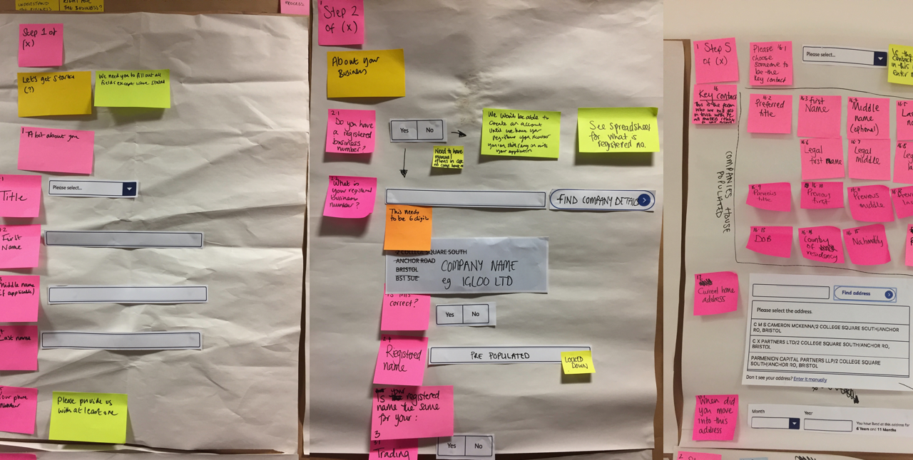
We created a giant app form in paper using cut outs of our existing patterns and took each section step by step on the wall. This way we could easily move components around and try out different field names before our development team began to build the prototype in code. Seeing the full form mapped out also helped us break sections into the right about information per page.

We mapped the whole app form using giant form elements
We also involved developers in the paper prototyping as they were able to help us understand the technical requirements alongside the experience. This meant everything we were designing was technically possible, for example being able to save each section of data and progress to the next page.
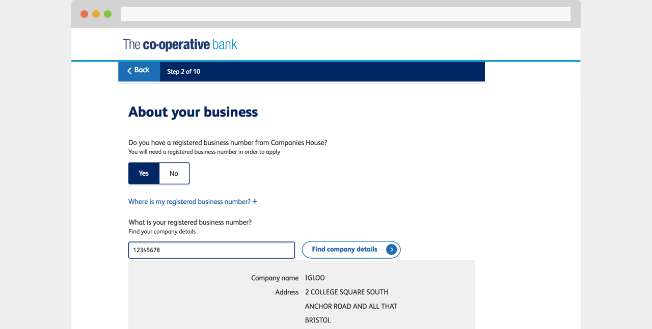
A technical and UX collaborative approach also led to us being able to allow customers to simply enter their business number and we would do the hard work and pull all their information from Companies House into the form.

Customers simply enter their business number and all their information from Companies House gets fed into the form.
Testing & iteration
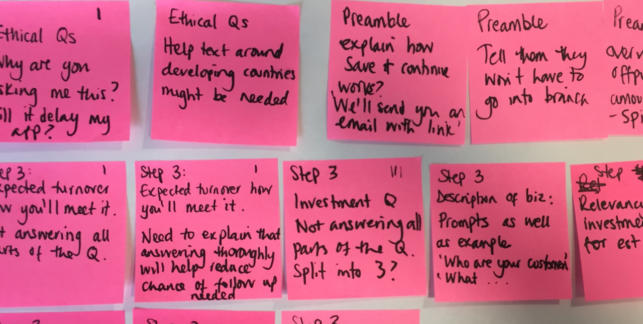
Throughout the design phase we did multiple rounds of testing with customers to gain insights on experience and usability. I would document all findings and recommendations against each section of the form and collate into a research reports to share with the team and stakeholders to agree next steps for iteration.
I would also hold weekly demos, where I would run through the updated prototype with all stakeholders and staff involved in the process to make sure the designs were complaint and meeting their needs too.

A collection of notes and recommendations post research used to inform the next round of iterations.
Delivery
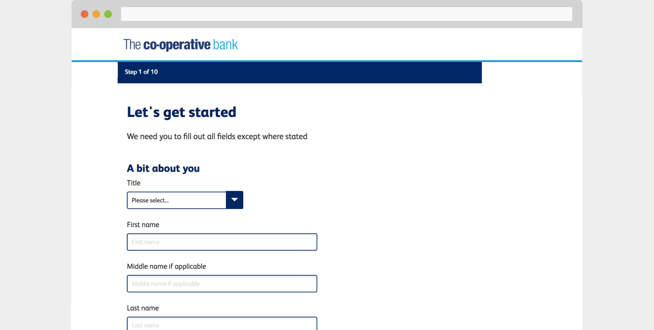
As we already had a fully working, high fidelity prototype in code, it was easier for the development team to flesh out and integrate. Most patterns and components had already been built too, which also helped with efficiency of delivery.

We were able to easily communicate form pages from paper into code using our existing pattern library
Results
Customers now find it much easier to complete a business banking form online. They don't have to worry about reams of paper, not fully understanding questions and posting their forms to the bank, to then potentially have to answer more questions if their writing wasn't clear. For the business, they have far less mistakes to deal with and this means they can spend more time analysing applications and making sure the bank gets customers that are right for them.