Whilst at TalkTalk, I was tasked with leading and improving the online purchasing experience for customers.

Since joining TalkTalk, my aim was to understand customer pain points across the full end-to-end journey and work with the business to come up with solutions to solve the issues. After discovering and working through changes on the bill, I was asked to help follow the same process on the sales website - another area that drives a high number of calls, complaints and costs for the business.
When joining the product area, the build of the new sales journey was already underway and I was tasked with 'applying the UX' once all the development had been done. This didn't feel right, so I worked with our product owner to start to embed UX into the process, so we would be releasing a journey that was right for our customers and met business needs.
Discovery
Business needs
The business needed to rebuild its core website, due to many technical and implementation issues. This meant there was a clear opportunity to redesign the experience for customers too. For customers, many would purchase TalkTalk's products through calling and using affiliate sites, such as Uswitch. Both of these avenues cost a lot of money and the return on investment, of sales through these channels, can often be low. An additional pain point the business suffers from affiliates, is the leakage of customers from initial purchase to set up. Many customers would be attracted to deals and vouchers on the affiliate sites and so would purchase, however once they had received their voucher would leave and go with another provider.
This is also compounded by relying on more third parties for delivery and set up which creates a poor experience for customers and so they leave due to these reasons. With incredibly high set up costs for each customer, high leakage of customers not even making it to one payment of the service, drove the need to reduce the amount of customers leaving between purchase and their first payment.
The business wanted to make use of its website and increase the number of direct online sales from purchase to first payment, and so reduce the reliability of phone and affiliate services.
In addition, the business also wanted to increase the uptake of other secondary products throughout the purchasing journey too. Most customers simply take TalkTalk's broadband product and that's it, however the business wanted to also introduce and promote the other products it had to offer, including it's flexible TV package and phone services.
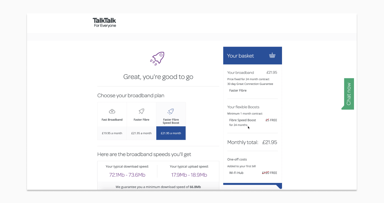
The original TalkTalk sales website design
User needs
After understanding the business needs, we needed to understand what the users needs were. A piece of research had already taken place before I joined the product which highlighted the key issues and needs for customers on the sales journey.
During a round of user testing, it became clear there was many pain points across the current online sales journey. The main problem area was that customers didn’t understand our products and how to find what’s right for them and their needs. Some didn't even know what products we offered until they were into the checkout and being asked if they wanted to add the. This linked with the number of customers purchasing over the phone rather than online, as on the phone they can ask questions about the products and also think they can get the price down or get a better deal.
The research highlighted general feelings around switching and purchasing broadband, such as anxiety that the product might not meet their expectations and confusion over billing and upfront costs. This was reflected in high numbers of customers leaving TalkTalk within the first couple of weeks to go with another provided, due to lack of clear communication around delivery and set up and an overall poor experience. The poor experience from purchase to set up, set the expectations for what it might be like to be with TalkTalk as a provider and would cause many to leave or not purchase at all. To help visualise where the pain points were across the journey, I created a user journey and experience map.
Defining the problem to solve
To help align the business and user goals, we decided to run a design sprint. The aim was to get everyone involved in the project thinking about all the customer and business goals and what problem statement we wanted to work from.
Problem statement
To add context to the sprint, we ran through all the research, our customer segments, current user journeys and invited stakeholders from around the business to talk about the business goals in more detail. Whilst listening to these sessions, we asked the sprint team to write down problems from what they were hearing, for example, 'customers don't know what products we offer.' We then got the team to turn those problems into problem statements using the 'how might we' formula. So this problem: 'customers don't know what products we offer' turned into this problem statement: 'how might we improve customers understanding of what products we offer?'
We then started to map the problem statements across the journey and we voted on what problem we should focus on. This became our sprint goal: a customer feeling confident in choosing products online from us. This combined both business and user problems and was a great start for us transforming the online purchasing experience.
Design & iteration
Starting to solve the problem through the design sprint
Now we understood the problem we were solving, we could start to ideation on possible solutions. Before diving into sketching, the team gathered inspiration from various patterns, designs and services other companies provide. This helped to analyse pros and cons of other designs, but also inspired everyone to get their creativity flowing. To help push our minds even more creatively, we started doing lots of quick sketches for ideas. Generating lots of ideas quickly helps to push beyond your first idea, which is often the least innovative and to generate a wide range of solutions. After sharing and talking through these with the team, we then sketched out some more structured solution sketches which included more detail to present back and vote on.
For our sprint, the voted solution was a 'product matcher', where customers would answer a few questions about themselves, e.g. where they live and their internet usage, and they would be recommended a product that matches up to those needs. This solution aimed to help customers with their lack of understanding which products are right for them and also helped educate customers on what the products are and how they are relevant to them, so they can make a confident choice independently.
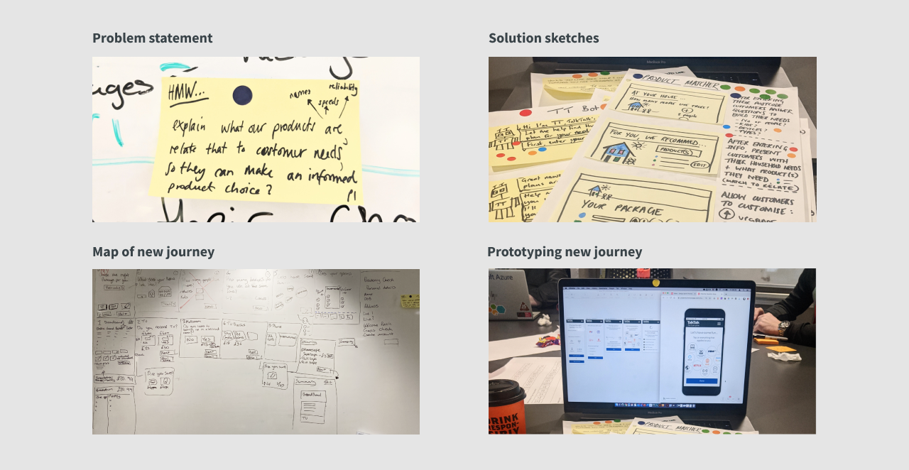
Problem statement, solution sketches, journey map and prototype for new sales design
Mapping the solution
As a team, we mapped out the solution into the steps a user would take. Referring back to all the research we had insight to, we designed solutions to known pain points. For example, breaking down complicated information by using simple copy with clear accompanying iconography. Another solution was breaking down the product selection process into small steps, so customers could focus on one thing at a time. Our insights had also shown us that customers come to the site at various stages of their purchasing journey. So we decided to map out two journeys that would meet the needs of these stages. The first journey named 'I know what I want' was aimed at customers who have done their research and understand what products they want. The second journey, named, 'help me choose' was aimed at customers who don't know what products are and what is right for them.
Prototyping the journey
The map became the base for our prototype to put in front of users and validate our solution. We collectively created the prototype together. Myself and another designer, set up files and started to mock up screens, whilst the rest of the team created content, sketched out ideas and gathered assets. At the same time, we worked with our researcher to start compiling a discussion guide. I created a live link to the prototype as we were building it, so the team could run through and pick up any typos, inactive states and missing information as we were designing the next steps.
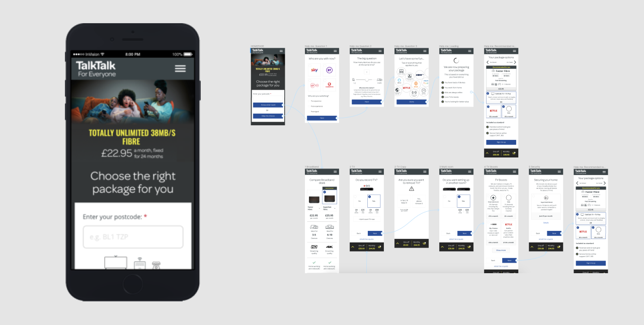
Design sprint prototype with two journey options
Testing with customers
On the last day of the design sprint, we invited five customers to test the prototype in our usability lab. This was to help reveal patterns across the experience that we had designed and to test if our solution met our sprint goal. As with other usability sessions, the rest of the team took notes and we started to form an affinity map of insights to reflect back on.
Overall, the solution we had designed had tested well, however we had some key insights which we knew we needed to iterate more on to get right for our customers.
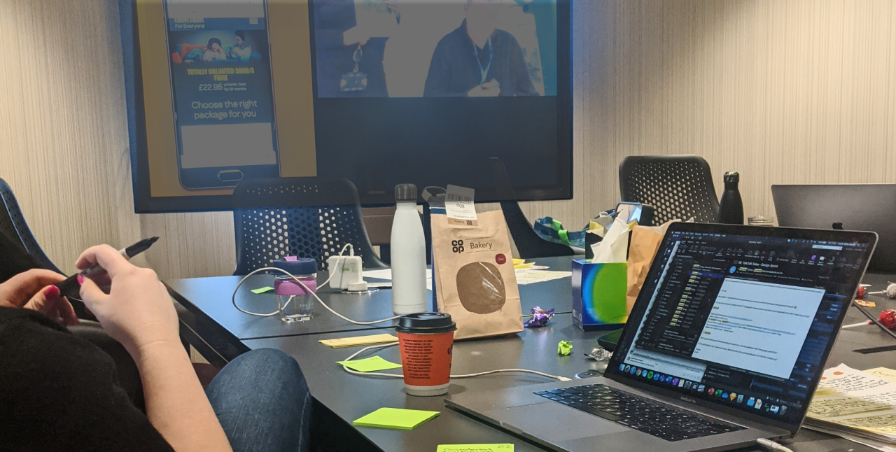
Observing in the design sprint user research session
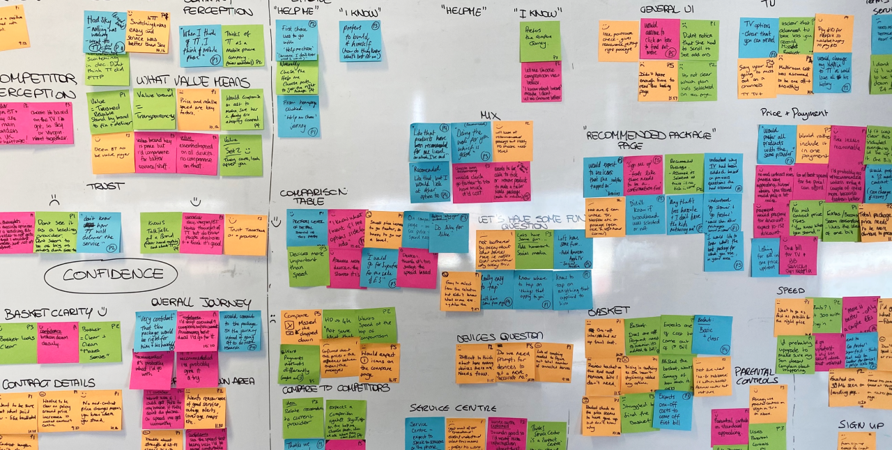
Insight wall from user research session
Building on outcomes of the design sprint
The design sprint gave us a great vision to work from. However, we needed to get more into the detail and start building out the full website and journeys. For the next couple of months, we started to test and iterate.
Side note: To add to an already challenging project, at this point in the project we had now gone into the first UK lockdown (due to coronavirus) and so were all working from home. Although most of us worked from home a couple of days a week, this took a lot of adjustment and we needed to develop new ways to collaborate and communicate.
Back to the project, the first place I started was creating a journey map of the new solution we had designed and tested during the design sprint. This involved taking the maps and prototype we had collaboratively created and developing that into a clear map on Mural. I also added the user pain points and delights we had discovered during the usability sessions across the map, to highlight areas which needed more iteration.
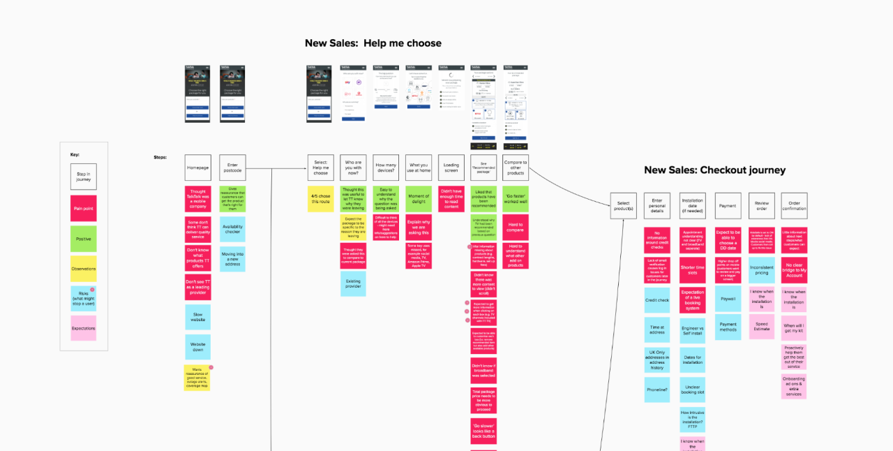
Insights mapped across the user journey
Areas to iterate further on included:
Building trust about TalkTalk as a brand.
Demonstrating all the products TalkTalk offers upfront.
Making it clear what some of our unique and useful services are, including Service Centre and 30 day guarantee.
Making it easier for customers to compare products that have been recommended to them, to other products TalkTalk offers.
Further building customers confidence in purchasing online and the next steps around delivery, set up and first bill.
Through mapping these pain points across the new journey, I was able to then collaborate with our brand manager to also start to develop the content that was needed to help solve these issues. This turned into a content map which could also be viewed and contributed to by the whole team.
Mapping out content also helped to redefine navigation, information architecture and landing pages across the site and I started to iterate on the prototype from the design sprint to design the whole site.
Improving navigation
After analysis of GA data and qualitative data from card sorting, we knew there were issues with our main navigation and how users moved around the site. The groupings of pages were unclear and didn't communicate clearly the information of each page. Users were confused by naming of items in the navigation and couldn't find the information they were looking for without going through numerous steps and would sometimes give up all together. To add to this, the primary navigation was mainly relevant to existing customers and would require a sign in to access, however even existing customers were unaware of this on not using this navigation.
Mapping the existing navigation on a Mural board, I facilitated a session to review all the data around the navigation as a team. After reviewing the data, we then split off into groups to reimagine what the navigation could look like, which would solve the user pain points we had discovered. We also had the challenge of adding new pages based on previous research and content mapping.
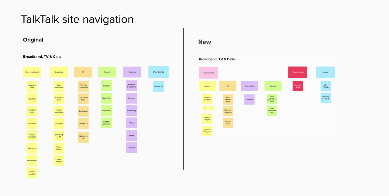
Site navigation card sort
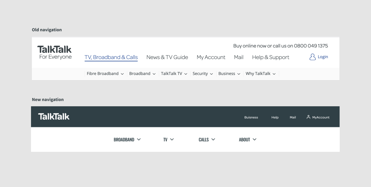
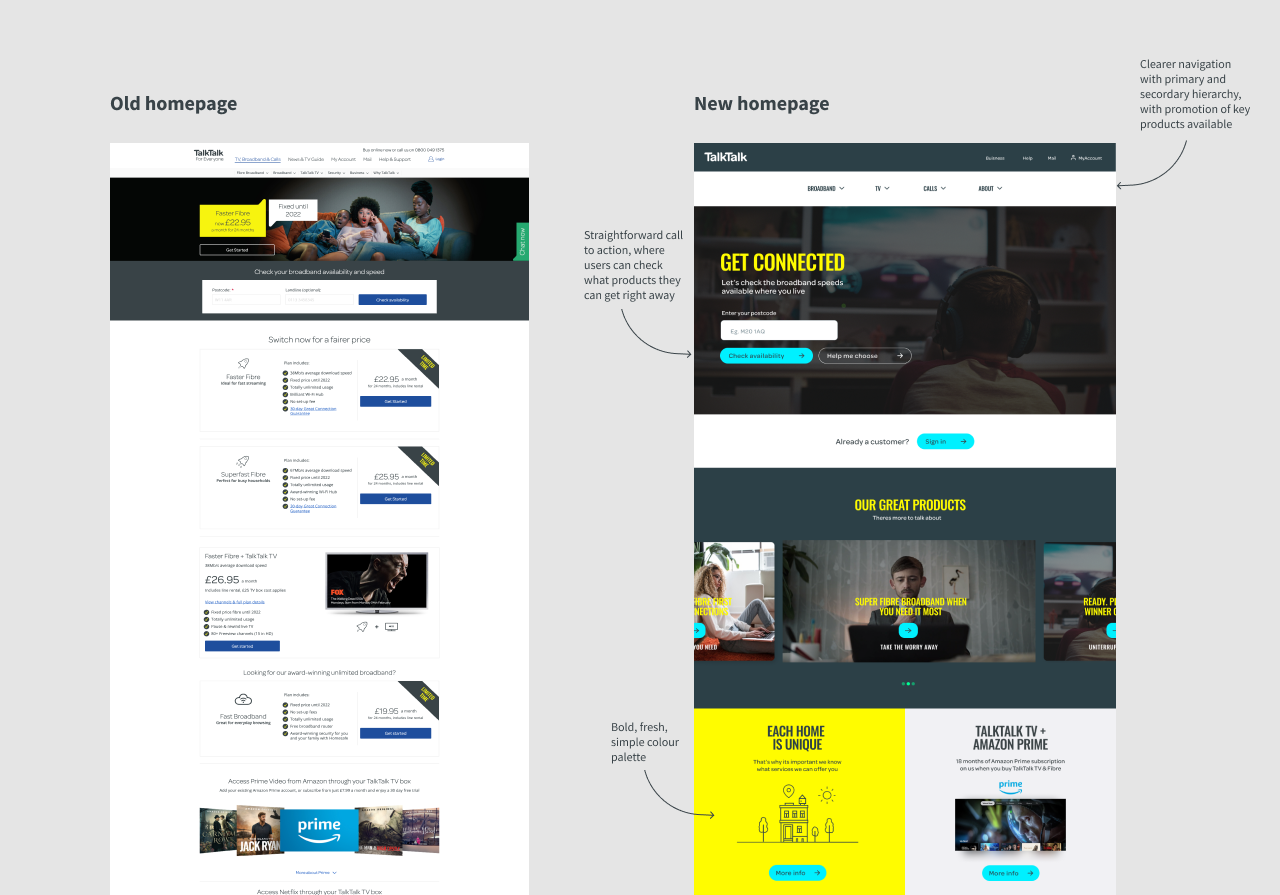
Old navigation and new navigation in context
With a few options, we then put the new navigation structures through a round of tree testing to see if we had improved navigation and the ability to find information for new customers. After the first round, we saw noticeable improvements, however there were still issues with some of the groupings and terminology of page names. With more iterations, we retested until we were confident with the navigational structure of the site.
Designing useful landing pages
Referring back to the content map and user insights, I started to build out wireframes for what landing pages across the site should be built up of. This included clear page headings, useful educational content, clear and accessible hierarchy and focused call to actions. In collaboration with our SEO manager and brand manager, we started to bring these pages to life with real content, brand imagery and storytelling.
Reimagining a digital brand and new user interface
Once we had the wireframes and the structures of journeys, pages and navigation, we needed to think about what the user interface (UI) would look like. A previous piece of work, that had been done by the whole design team, was to review the current live UI to understand the positives and negatives. Through this work, we had discovered that the UI had accessibility and usability issues and didn't represent the branding as well as it should. In addition, we also discovered that the brand style guide was very print focused and this meant typography, colours and imagery didn't translate as well on screen.
To explore the UI and also the digital branding, we did a two week 'blue sky' design sprint. The aim of this sprint was to experiment and really stretch the possibilities of what the UI could be. We started by going through UI and brand issues we had discovered to understand the problems that needed addressing. We then looked at competitors and examples of great UI design to gather inspiration.
To help guide, but not restrict us, we also pulled in our recently created 'design principles' and found examples of other design, branding and UI that had met those principles. With all this visual information gathered, we populated our Mural moodboards, shared with each other and prepared for ideating.
Initial ideation began looking at core elements to the UI and brand, for example, colours and typography. Through exploration, we decided the brand colours needed to be more vibrant and therefore feel more modern and bold on screen. This didn't mean changing the colour palette completely, but simply brightening up colours and adding in extra shades for more texture. However, we also knew that the current brand colours posed accessibility problems, so needed to make sure the colours whilst being vibrant, didn't cause visibility issues.
The current brand typefaces had been considered and set well for print, but had simply been used in digital without much thought around size, line heights, spacing or complimentary combinations. Exploration led us to try using different typefaces and bolder, cleaner typography structures. We also tried experimenting with the existing fonts, but tweaking sizes and spacing to feel more modern, clean and add hierarchy.
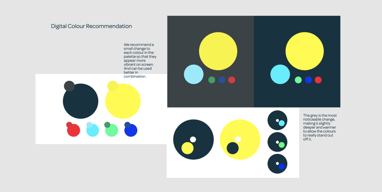
New digitally focused colour palette
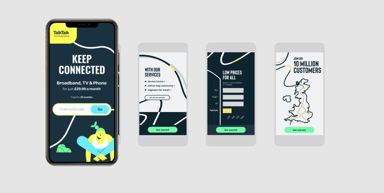
Branding experimentation of colours, image and typography
After exploring the foundations, we then experimented with imagery, graphical elements and iconography to bring the brand to life even further. And started to also apply our colour and typography experiments to UI elements such as buttons, links, tables, banners and cards.
With collaboration with our brand team throughout this sprint, we ended up with an agreed new digital brand and UI to take forward and apply to our wireframes and prototype. In addition to this, the new UI we had created started to form the basis on the new design system which would eventually be rolled out across the full service.
Iteration and testing
As we continued to build up the journeys, navigation, landing pages and UI, we also built upon our interactive prototype in unison and continuously tested our designs with users. At this time, we were still in lockdown and so had a new challenge of testing fully remotely.
Using Zoom, we were able to connect with users and run them through prototypes to gain insights and validate our assumptions. As the team was still working remotely, we used a Mural board to collate notes, pain points and observations across the journey. Post the sessions, we would create affinity maps of key themes, map them across the journey and also map the notes against the screen designs to help communicate areas of improvements to the team and also wider stakeholders.
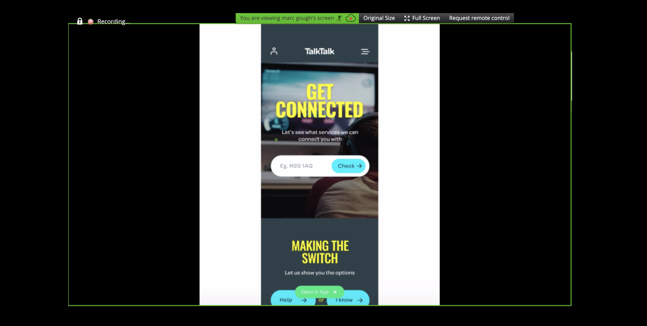
User testing prototypes remotely using Zoom
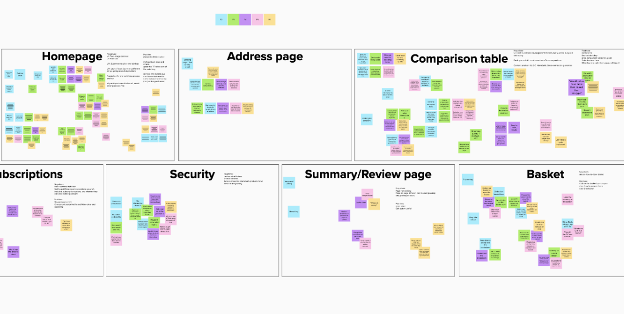
Affinity map of user testing insights
Between each round of testing, I would collaboratively iterate on pain points, ready to retest and validate our new solution. Key areas of iteration of the site were around copy, especially regarding removing jargon and explanation of important services. As well as iterating on the copy itself, I also started to add in visuals to help bring explanations to life too, this helped to keep copy short and simple and add context for easier understanding.
Another key area of iteration was around the two journeys we had developed from the initial design sprint. We started to discover that customers were misinterpreting the two journey entrance points and therefore going down routes that we not relevant to them. This was causing a lot of frustration and wasted effort, especially for customers who knew what they were looking for and wanted to go ahead and purchase, but were taken down a route of answering lots of questions to help them make the right decision.
To help solve this problem, again content and positioning of call to action buttons helped to separate the two options. I also decided to try making one of the buttons a primary button to add more distinction. This decision was also backed up by analysis of some recent experiments which proved that most customers have done lots of research (on and offline and not only on our site) before coming to our site to purchase, so when they do come to our site they are ready to get straight into the purchasing journey. Therefore, I designed the primary call to action as the main journey through to purchasing, with the other journey (which is aimed at users who need more help understanding our products) as a secondary call to action. To validate this design decision further, we tested this with users and had success with this approach.
Presenting back to key stakeholders as regularly as possible
Although we collaborated with many key stakeholders throughout the process, to get the best out of all business expertise, some more senior stakeholders were not available to collaborate at this level. Therefore, to help keep all senior stakeholders informed in the progress of the project, we held regular show and tells which involved presenting latest designs, research insights and next steps. This was a chance for stakeholders to challenge our design, provide insights on any recent business decisions and suggest ideas to test next.
These sessions were key to moving the project forward and making sure we were meeting both customer and business needs. This was even more important as we moved from discovery and design into delivery, as pressures to action all the work we had done mounted as the need for increased sales online was high.
Delivery
Feeding into the delivery roadmap
In order to take all the insights and design we had developed in previous phases into delivery, I started to collaborate on a delivery roadmap with our product owner. This involved breaking down all the work we had done into user stories, which would form the starting point for development. Through creating user stories, we could also start to prioritise work based on user needs which had more impact. For example, we knew that the 'I know what I want' journey was the journey most users would take to purchase and the 'help me choose' journey would have less users, therefore we prioritised this journey to be developed first.
Collaborating with the development squad
Although we had collaborated with most of the development team throughout the discovery and design phases of the project, we were now more focused on delivery and our focus was now to help develop and deliver the new designs. To help with this, myself and our UI Lead, joined the squad and started to attend their scrum ceremonies.
Myself and our UI Lead were involved with communicating design decisions, user flows and all interactions across the journey. We used prototypes and journey maps to help communicate steps and how customers would move through the areas of the site. I also focused on communicating the customer needs and insights we had gained throughout the process to bring the project to life and help the developers feel connected to the purpose of the project.
Bringing the design system to life in code
To help the development team build pages and journeys, I suggested that the design system, from foundations to complex patterns, should be built first. This meant that multiple development squads who were working on the project could pull from the same source of patterns, which would help with consistency and efficiency. However, building a design system is not an easy task, especially with the added pressure of senior stakeholders wanting the new site live as soon as possible.
Again, this meant we needed to break down and prioritise elements of the design system. We started off with ensuring the foundational elements were developed first, this included: colours, grids, vertical spacing and typography. Once these were understood and set, the developers could get on with building out the key components needed for the first journey.
To aid developers with the front end development of the components, we shared the Figma board, which contained all the components and included detailed specifications. This meant, developers could see the components in context and also at a detailed level to build from. At first, I was advised not to provide such level of detail, as it was assumed our developers would use the 'inspect' feature of Figma, however this was a new tool for most of the team so they didn't know how to use it so it and also, due to the pace of design, some of the designs were not pixel perfect at this stage, which led to unnecessary mistakes being made in development.
However, through conversations with developers in design review sessions, during ad hoc calls and in retros, I took the action to go back to my original idea of sharing detailed specifications for each component, to help both developers and the quality of the product. Within a matter of days we could see the improvement in development output (and happiness of developers). In addition, stakeholders were incredibly impressed by the standard of design to development when we shared even simple components in our show and tell sessions.
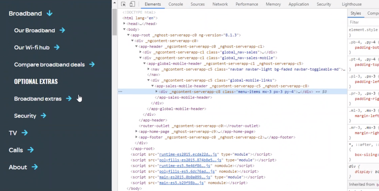
Collaborating with the development team on the build
New requirements coming to light during delivery
One of the biggest challenges I faced on this project was the change in scope, due to the addition of new requirements. Whilst part of my time was spent collaborating with developers on delivering components and pages, the other part was spent iterating on designs due to changes in requirements, one of which was a complete change of the products we offered.
When new requirements came in, my first challenge was to stress test what we had already designed with the new information. With a change in product offering, this meant going through the whole journey, landing pages and navigation to make sure user needs would still be met. One of the biggest areas I needed to focus on was a comparison table of the broadband products we offered. With the change in products, came a change in how the business wanted to sell the products too and more emphasis was now on products coming in packages, rather than separate items.
The main challenge was to work iteratively on the comparison table, but also not hold up any development work going on in relation to the table. This involved lots of collaboration, sharing of work and managing expectations to ensure the business was happy with the direction of design and the development team wasn't wasting time and effort building the wrong thing.
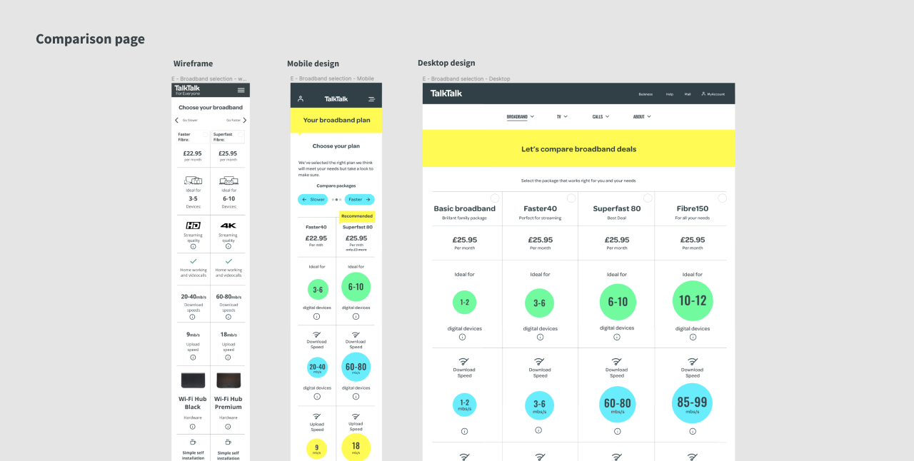
Comparison table wireframe to high fidelity design
Results
As I write this, the project is still in delivery and I hope to update this section with key metrics that show an improved experience of purchasing products for all customers.
With regards to the project itself, it was one of the most challenging, yet rewarding projects I had been a part of, mainly due to most of the project happening during the time of a global pandemic. However, one of the greatest results for the team, was being able to successfully continue to design and develop a new online purchasing journey led by customers, for customers.